Web design keeps changing as technology, user habits and visual culture develop. Businesses want websites that not only look good but also work well, feel current and help them stand out in a crowded market.
Here are some of the design trends and established UX practices shaping modern websites in 2026.
Explore website redesign best practices.
Minimalism remains important
Modern websites are becoming cleaner and more focused. Instead of filling every part of the page, designers use space, clear structure and simple navigation to help visitors concentrate on the content.
Common features of minimalist design include:
- generous white space;
- a limited colour palette;
- simple shapes;
- fewer distracting elements;
- a stronger focus on content.
This approach can make information easier to understand and give the interface a more modern feel.
The best design helps people reach their goal without distracting them with unnecessary details.
Depth and glass-style interfaces
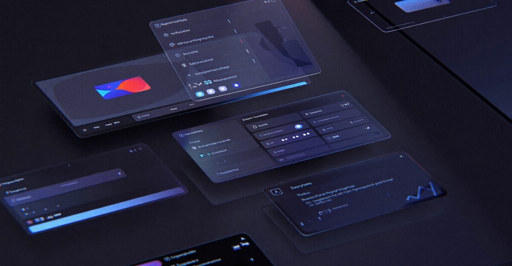
Transparent layers, soft blur effects and glass-like surfaces continue to appear in modern interfaces.
This style, often called glassmorphism, can add depth and give a digital product a more technological look.
It is often used in:
- corporate websites;
- SaaS platforms;
- digital products;
- dashboards and admin panels;
- mobile applications.
Dark colour schemes
Dark interfaces remain popular because they can create a modern, focused look with strong contrast.
When combined with subtle lighting and carefully chosen accent colours, a dark design can feel polished and professional.
Common combinations include:
- graphite and white;
- black and blue;
- dark grey and purple;
- deep black with restrained neon accents.
Typography becomes part of the visual identity
Typography is becoming a stronger part of the overall visual composition.
Modern web design often focuses on:
- large, clear headings;
- good readability;
- useful contrast between text sizes;
- a clear information hierarchy.
Well-planned typography makes content easier to scan and can give the website more character.
Micro-animations
Small animations can make a website feel more responsive and natural.
Examples include:
- content appearing smoothly as the user scrolls;
- subtle button animations;
- hover effects;
- smooth transitions between interface states;
- interactive cards.
The key rule is simple: animation should help the user understand the interface, not distract them.
AI as a design tool
AI is becoming a practical part of many design workflows.
It can help with:
- generating early ideas;
- creating illustrations;
- exploring colour combinations;
- speeding up early layouts and concepts;
- automating repetitive tasks.
The designer still makes the key decisions. AI is most useful as an assistant that supports the creative process rather than replacing it.
Responsive design is a standard
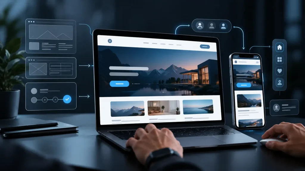
People use websites on many different devices, so responsive design is no longer an extra feature. It is a basic requirement.
A modern website should work well on:
| Device | What matters |
|---|---|
| Smartphone | Fast navigation and easy touch controls |
| Tablet | Good use of the available screen space |
| Laptop | Comfortable reading and interaction |
| Large monitor | A layout that uses the larger space effectively |
Thoughtful responsive design gives users a consistent experience regardless of screen size.
Balance visual impact with usability
Modern web design should be built around the user. Even impressive visual ideas need to support the purpose of the website rather than make it harder to use.
The best digital products combine an attractive visual style with speed, clarity and easy navigation.
Please also explore website redesign best practices.
Conclusion
Web design trends in 2026 continue to focus on simplicity, technology and usability. Minimalism, glass-style interfaces, strong typography, micro-animations and AI-assisted workflows can all help create modern websites that look good and are comfortable to use.
Trends should not be followed simply because they are fashionable. They are useful when they help create a website that feels current, works well and gives users a better experience.
Sources & further reading:
The trends and design practices discussed in this article are supported by current industry research and established UX guidance. For further reading:
- Adobe Digital Insights – Top Firefly Prompt Trends
Adobe analysed millions of anonymised Firefly prompts across more than 20 countries. The research found continued strong interest in minimalism and a significant rise in glassmorphism, helping to support both as relevant visual trends going into 2026. Adobe Blog
Read the Adobe research - Nielsen Norman Group – Web UX Study Guide
NN/g includes minimalism, dark mode and glassmorphism among important web-design topics and provides research-based guidance on visual design, usability and accessibility. Nielsen Norman Group
Explore the NN/g Web UX Study Guide - Nielsen Norman Group – Glassmorphism: Definition and Best Practices
A useful reference on translucent interface elements, visual depth and hierarchy, as well as the usability and accessibility risks of overusing glass effects. Nielsen Norman Group
Read the NN/g glassmorphism guide - Apple Human Interface Guidelines – Motion
Apple recommends using animation purposefully to provide feedback and help users understand an interface, while avoiding unnecessary motion that distracts from the experience. Apple Developer
Read Apple’s motion guidelines - MDN Web Docs – Responsive Web Design
MDN describes responsive design as a standard approach for building websites that work effectively across different screen sizes, devices and resolutions. MDN Web Docs
Read the MDN responsive design guide